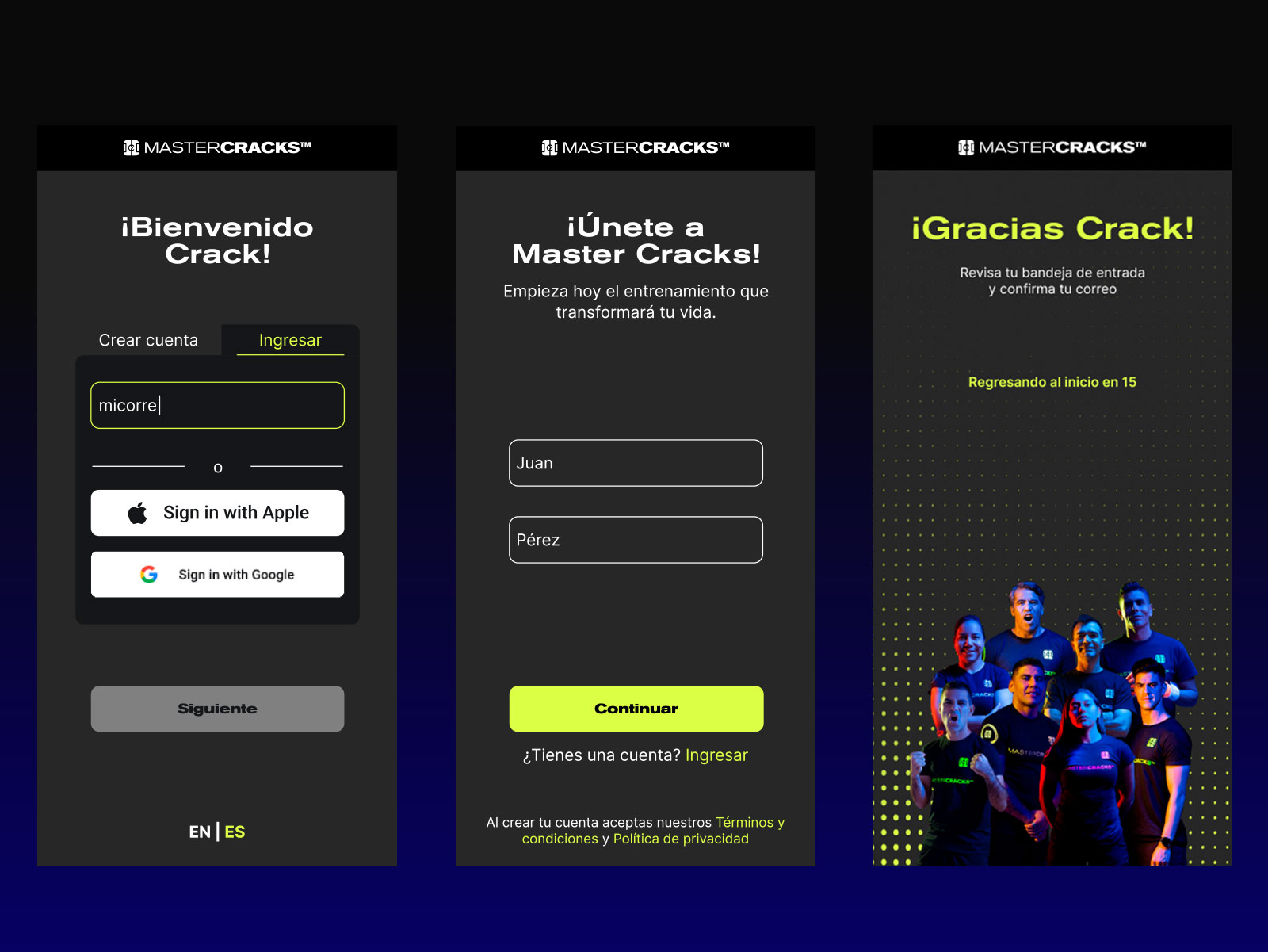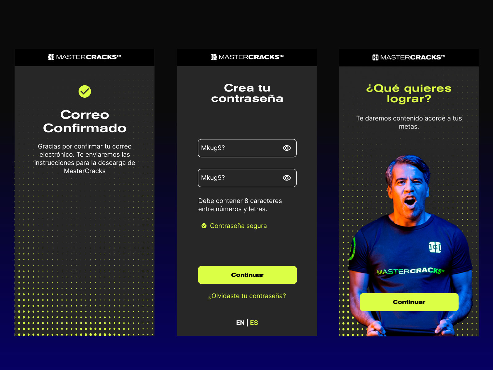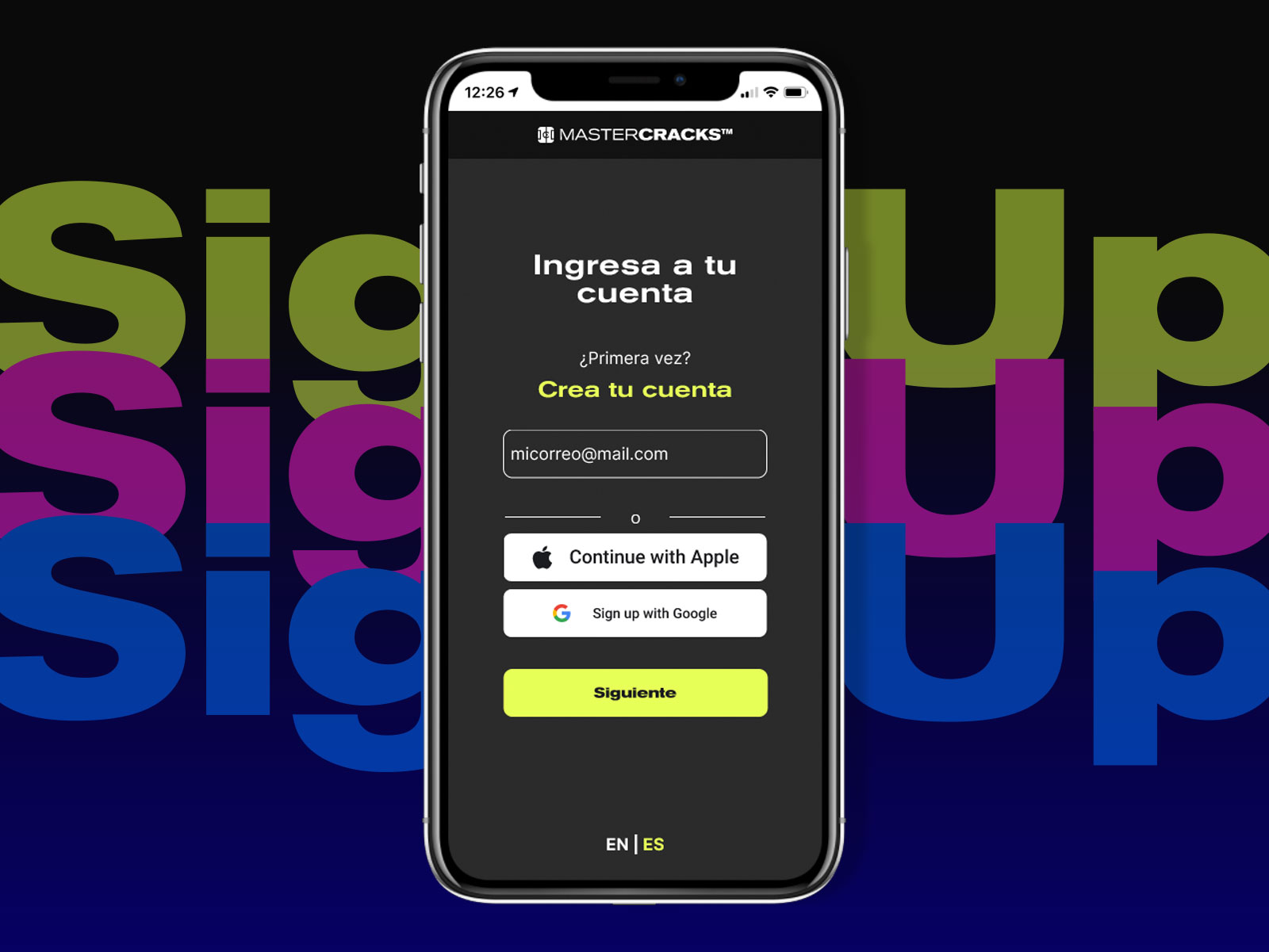
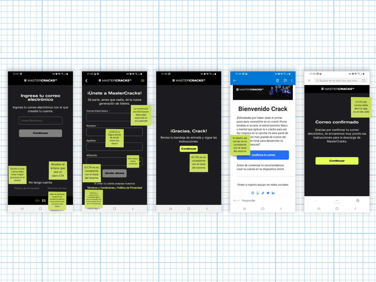
When I started working for MasterCracks, one of my first tasks was to analyze the sign up and onboarding process. The problem was that users had difficulties creating a new account and were unsure how to proceed after the download of the app. What you see here is part of the final result, But there was a whole process behind it.
Analysis
During the analysis, I discovered that in the initial screen, the option to sign in for an already created account was presented, but there was no clear call to action. The highlighted options were regarding the language selection and the “Create New Account” option had the same color, font size and hierarchy than the rest of the body text. I also discovered that the call to action button along the process was not standardized and there were 3 different sizes along the screens.
I also discovered that password verification had very low security standards, requiring only a minimum of five characters, but I was able to create a password using “12345” without any errors showing.
Wireframing
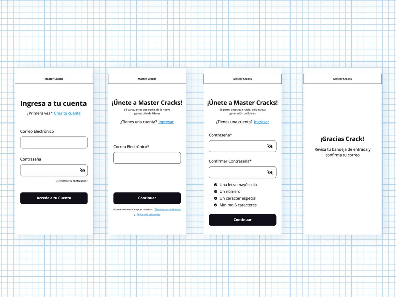
I wireframed a proposed flow that includes redesigning the information architecture, standardizing buttons to give consistency, and redefining clear standards for call to actions. In the “create a password” process I defined security requirements and considered use cases like errors, recovering password process and more user friendly texts for emails and welcome screens.
High Definiton UI
The next step of the process was to design a high definition prototype with the standards and use cases created, considering all the possible paths and clear UI rules to start setting a Design System for development phase.