Case Study: Leo AI Windows

Context
Leo AI is the world’s first engineering design co-pilot. Deep-learning researchers building the world’s first Large Mechanical Model (LMM), the proprietary foundational model at the core of Leo. Equipped with domain-specific capabilities to design concepts, answering technical questions, finding parts in the PLM or websites of authorized vendors, and collaborating with fellow engineers. All integrated into CAD editors.
The Niche*
- 337k Mechanical Engineers just in the US.
- 421 billion USD Mechanical Engineer market size.
- 9949 of Mechanical Engineer companies registered in the US.
- 77% of companies are exploring the use of AI for their business.
*Data from US Bureau of Labor, Statista, and Crunchbase.
The User
- 18K Users.
- 17% Recurring users.
- 16.6% Paid Users.
- 6% Enterprise tier clients.
From this data we can interfere that the majority of the active users belong to a team in an organization, share information with their peers and that they use the product on a paid plan provided by the company they work for.
Objectives
Redesign the Leo AI app from static pages to interactive windows that allow creativity and flexibility for mechanical engineering work, and provide clear documentation and prototypes for developers and stakeholders.
The Challenge
The redesign implies moving from static pages type of layout to a more CAD software type of application that allows autonomy and customization for users. Such a big change can be overwhelming for users. Also, the redesign must be function over form, demonstrating that the redesign is not for aesthetic purposes only.
The Goal
- Design all aspects of the Leo V2 flexible, resizable windows.
- Document all specifications in a clear way, so developers can implement this update.
Methodologies
- Research about the state of the art and applications of this type of interactions
- Analysis of the current similar interactions.
- Prototyping.
The Team
Product Designer, Product Manager, CTO.
Research
Defining what the user can and can’t do is crucial for setting the boundaries of the project and avoiding the overselling or hyping of unrealistic expectations for users and stakeholders alike. According to author Nir Eyal in his book Hooked: How to Build Habit-Forming Products, giving users a sense of autonomy can boost engagement with the product. On the other hand, authors Cliff Kuang and Robert Fabricant, in their book User Friendly: How the Hidden Rules of Design Are Changing the Way We Live, Work, and Play, discuss the “Paradox of Choice,” stating that presenting users with too many options can overwhelm them — what Jakob Nielsen refers to as overloading the “cognitive load.”
Designing the Interaction
Resizing, dragging, and overlapping windows were originally designed by engineer Bill Atkinson for the Apple Lisa, based on a presentation of Smalltalk at Xerox PARC, which featured a “window”-based user interface. Atkinson assumed that these windows could be overlapped like sheets of paper on a desk — a metaphor Apple was already exploring. By understanding these fundamentals, we can extract the basic features of this design.
How Might We
- Show the different behaviors of the windows and the interaction between them, when various windows are open.
- Define standards to avoid overwhelming the user with to much “freedom”.
- Prepare a prototype that shows the window interactions.
Analysis of Current Similar Interactions
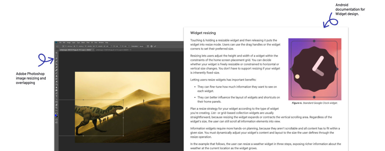
To gain a comprehensive understanding of the interaction, I analyzed other products that currently use similar features. Android and its widget functions work in a similar way, allowing widgets to be resized and dragged based on a grid that serves as a guide for resizing and placement. Through my research, I found documentation and design guidelines for Android Developers that dive deeply into this feature and even provide code examples. Additionally, image resizing in Adobe Photoshop offers a clear example of user interactions such as dragging, resizing, and overlapping.
Prototyping
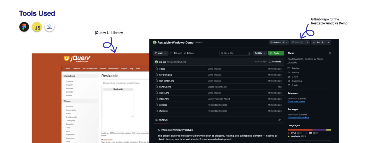
Prototyping a design in Figma (or any other similar tool) can help visualize the design, and features like Figma’s Dev Mode can assist front-end developers in accessing the Design System specifications for components and layouts. However, prototyping with design tools can have its limitations. In cases like this, where dragging, resizing, and overlapping are required, a tool like Figma can limit the overview of such interactions. As alternatives, tools for animating prototypes were considered, but based on past experience, I decided to create a coded prototype using jQuery UI’s interactive functions, such as drag, drop, resize, and select.
Definitions
With the goal of setting boundaries for the UI capabilities, some definitions were taken, such as establishing a grid to which all elements will adhere, a minimum margin that anchor points in the grid will have, ensuring that the elements will also have that gap between them, and the minimum and maximum sizes the windows will have in relation to the grid.
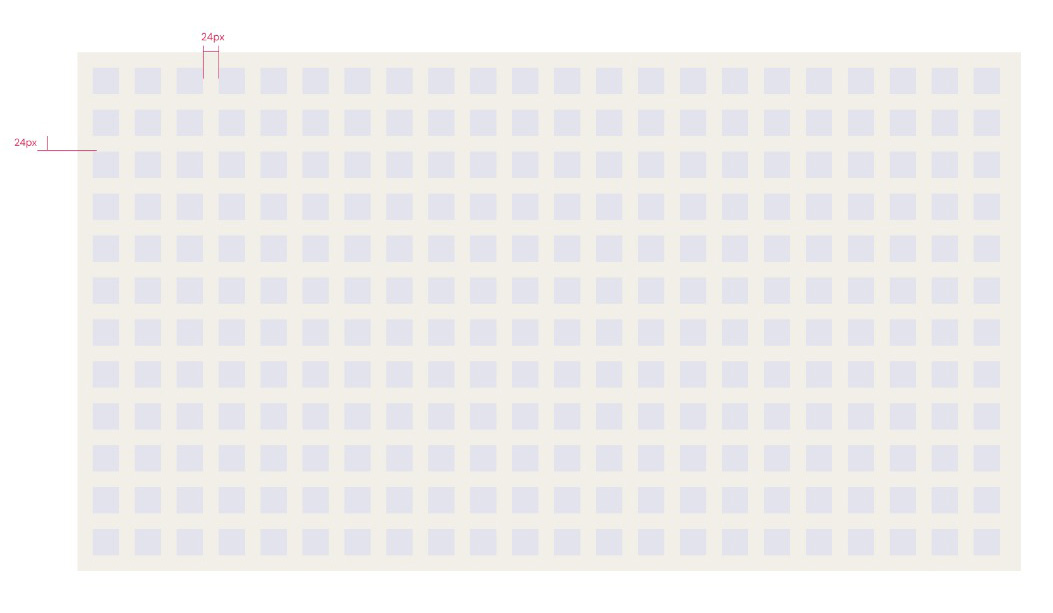
Reference Grid
Grid is composed of square cells of 40x40px with a 24px gap between them. Unlike regular CSS flexible grids, this grid cell and margin sizes remain constant, regardless if the browser window gets resized.
Minimum Window Size and Default Window Size
By default, when a new conversation is initiated, the chat window will have a size of 12 cells width by12 cells height, located at the center of the screen, for screens 1200px width and up. For screens below 1200px width, until 768px width, the default window size is 10 cells width by 10 cells high. Sizes below that should use the minimum size. Minimum size of a window is 6 cells width by 6 cells high.
Minimum Window Size
Default Window Size
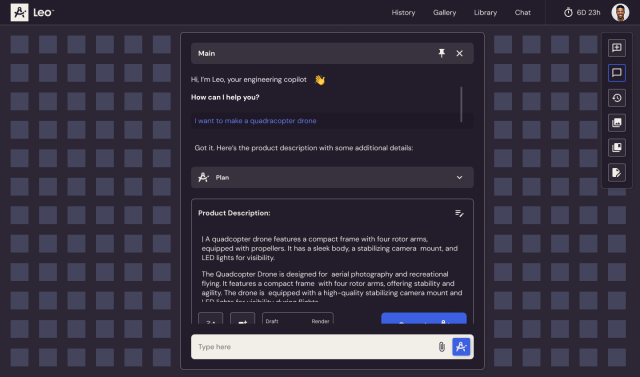
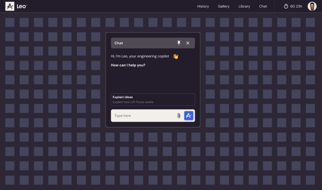
Leo AI New UI