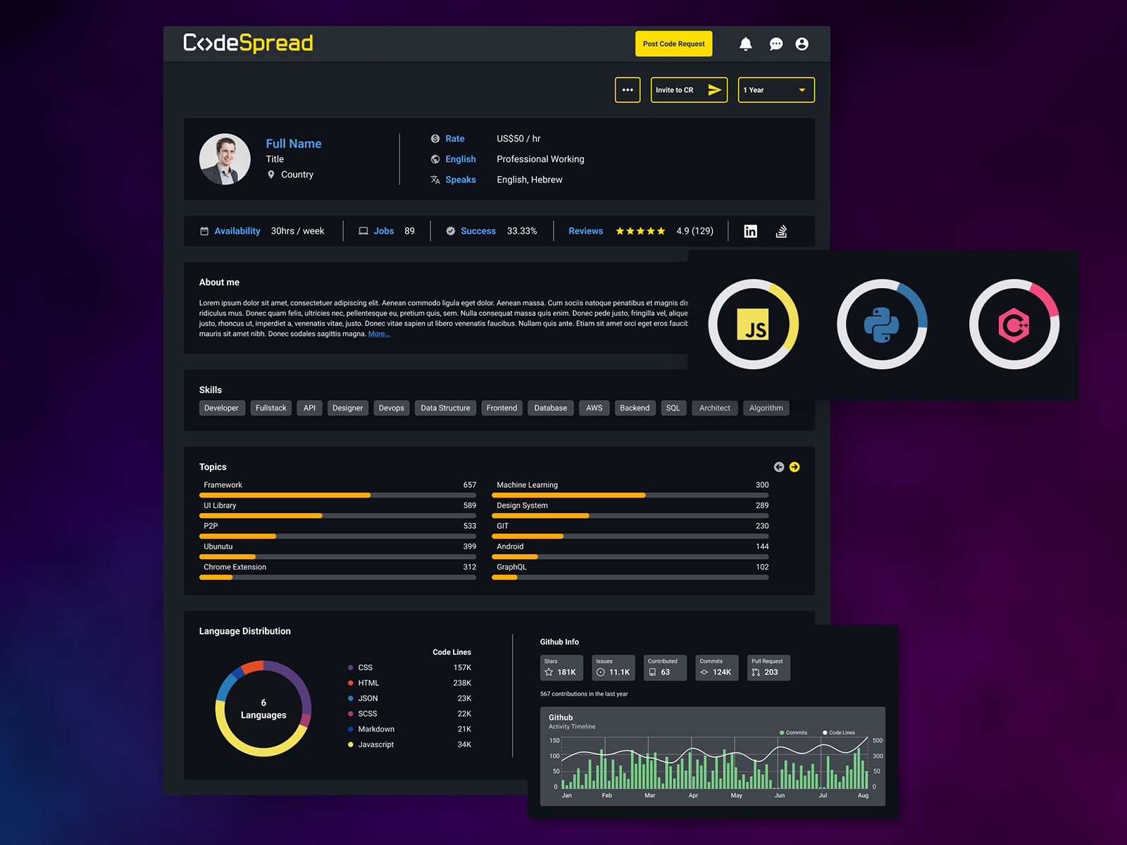
The developer’s profile, unlike other freelancer marketplaces, shows additional info regarding the developer’s activity and scores. The statistics are shown by a 1-year time frame with a feature to change the time frame on user’s demand.
For all data regarding Github, I considered it a MUST to have the same icons for the Repo´s and all related info, as well as all language statistics to be shown in different styles of graphics, using Github’s color guide, not because of aesthetics, but for a matter of UX (recognition rather than recall).


