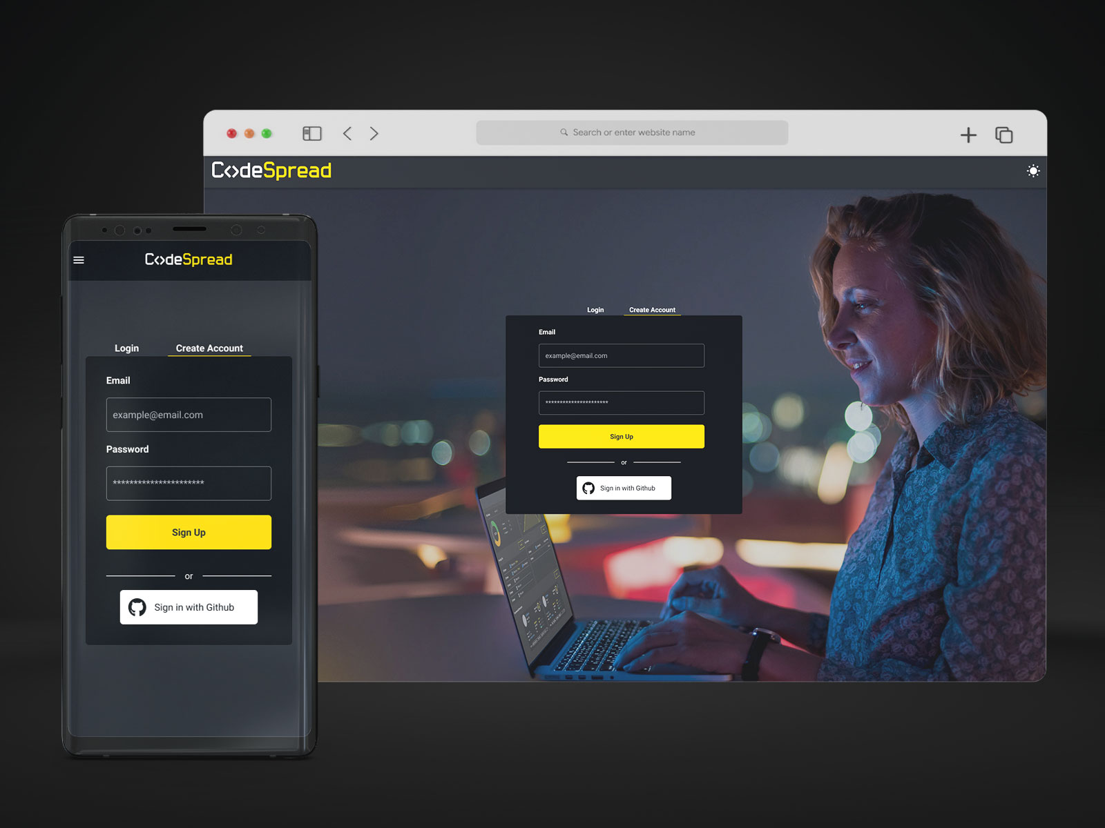
I did a full redesign of CodeSpread’s look and feel, including the login page. The concept was to keep the characteristic yellow and dark theme tones but with vibrant night light colors. The background picture was selected to show interaction with the platform, but also because the system, in general, has plenty of graphs, illustrations, and icons, but a lack of realistic photographs and human elements and faces, which, according to Neuroscience studies, makes a product more friendly and less “talking to a machine” perception on users.
Login UI

