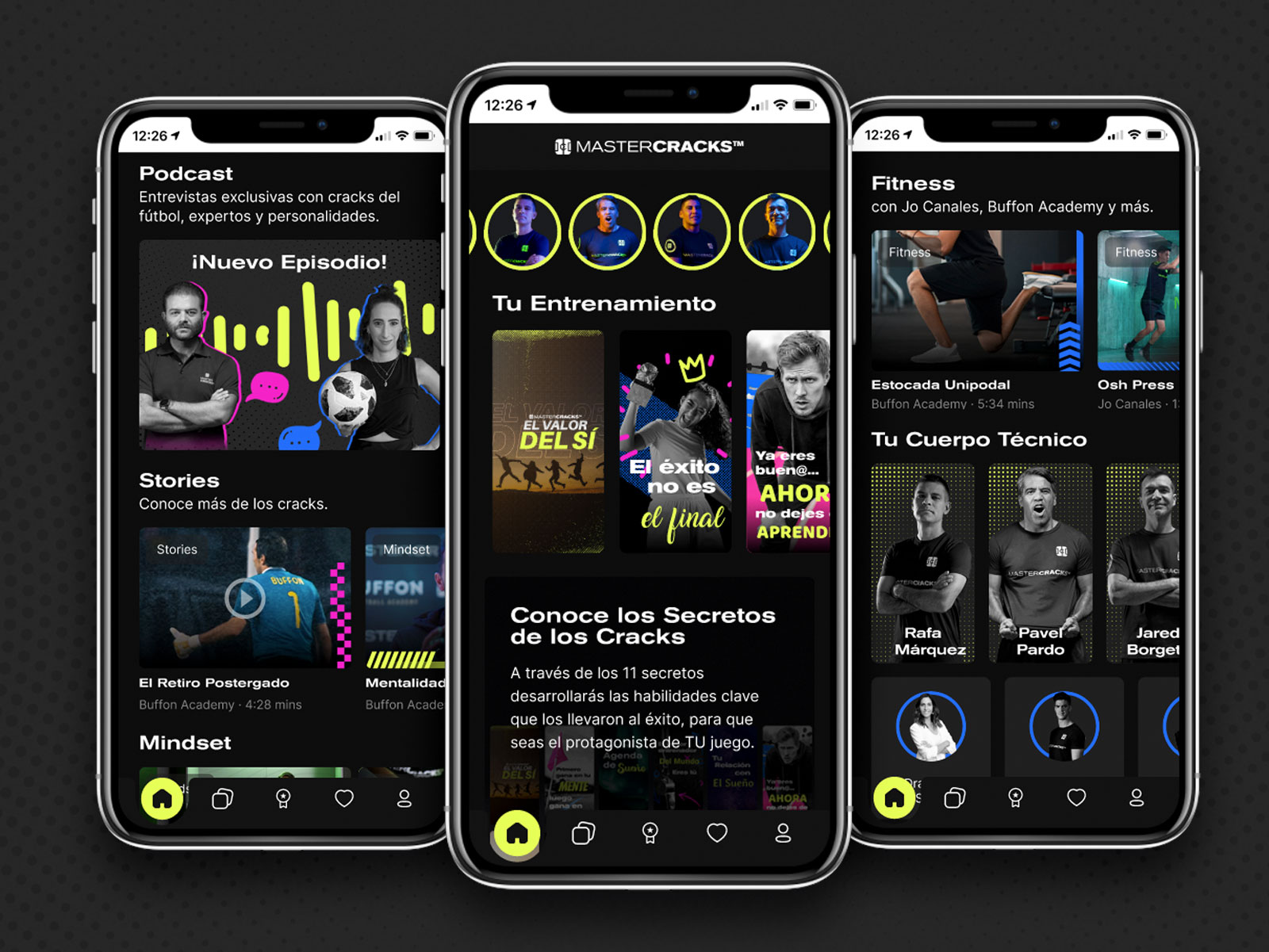
I redesigned the home for the mobile app, not just in its look & feel, but the entire functionality. From a static page with preorganized content, to a dynamic page with a content feed showing newest videos, podcast episodes and interactive “tips” based on the user preferences (based on a small questionnaire at the signup). The home information architecture and storytelling gives prominence to the user goals and what they want to achieve, and then, to the sponsored “cracks” (well known retired football players and fitness trainers) as part of your coaching team, to achieve those goals.
The look & feel features different types of shape and color contrasts to avoid visual over saturation with all the information being displayed.

